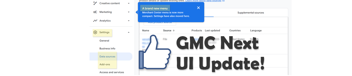
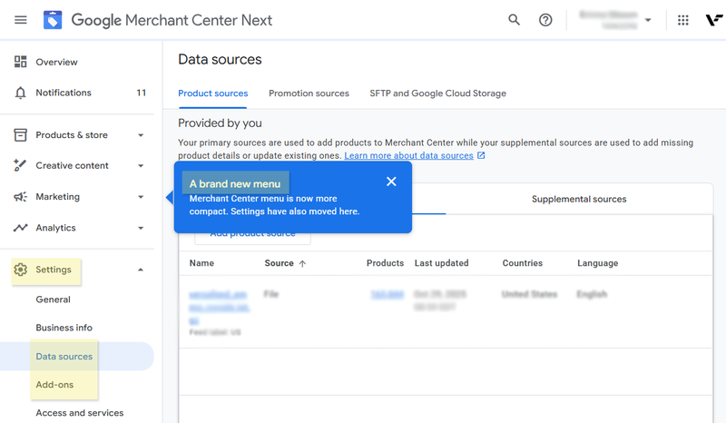
Google Merchant Center Next just rolled out a few subtle but impactful UI adjustments — and they make the platform far more workable for data feed managers. The once-static navigation “Sections” are now collapsible, helping clear away much of the clutter that made feed management feel visually overwhelming. The Settings gear has also migrated from the top right corner to the left-hand navigation, a small design decision that actually makes daily workflow smoother. Importantly, key tools like Data Sources and Add-ons are now easier to find instead of being buried several clicks deep.
Merchant Center Next has gotten a mixed bag of reactions, especially from feed pros who live and breathe data feeds and diagnostics. Still, this update feels like a step back to common sense. The original redesign deprioritized the core functions — uploading, validating, and monitoring product feeds — which are the backbone of the platform. By surfacing those areas again, Google seems to be recognizing that Merchant Center is not just a marketing tool but a data engine powering the entire Shopping ecosystem.
This redesign doesn’t solve every friction point, but it’s a meaningful step in the right direction. The interface feels less like an obstacle and more like a workspace again — and that’s a quiet win for anyone who lives inside Merchant Center daily.